Moscow Central Hippodrome, once legendary, belongs to the biggest horse racing arenas in Russia. Nowadays its stands are mostly empty, except for major competitions, which are held several times a year and gather spectators. The aim of the project is to restart the brand, generate fresh interest in the Hippodrome, turn it into a point of attraction, taking into account the desired image and target audience.

big
Original size 1754x1240
big
Original size 1754x1240

Using the metaphor of an embodied utopia and pursuing communication goals — to inform and attract the new audience of the Hippodrome without driving away the existing one — the author of the project proposes an outstanding, but meticulously calculated signature style, including basic and street media, navigation, souvenirs and a spectacular deluxe edition. Thus, people might come to associate the hippodrome not only with sports, but also with a rich history, original aesthetics, festive atmosphere, as well as an exciting spectacle.

Original size 1754x1240
Original size 1536x509
Original size 1754x1240

Basic fonts

Original size 1120x792
Original size 1754x1240

Basic fonts

Original size 1754x1240

Basic fonts

Original size 1754x1240
Original size 1554x604
Original size 1670x1034

Documentation

Original size 1754x1240

Business cards

Original size 1754x1240

Name badges

Original size 1665x1032

Invitation

Original size 1754x1240

Tickets

Original size 0x0
Original size 1754x1240

Programmes

Original size 1534x578
Original size 1754x1240

Posters

Original size 1754x1240

Placard

Original size 1754x1240

Horse carrier

Original size 1238x884
Original size 1555x1033

Flags

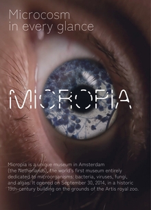
MICROPIA
MICROPIA
6
МИКРОПИЯ — УВИДЬ НЕВИДИМОЕ Экспонаты этого музея настолько крошечные, что увидеть их нельзя без микроскопа. Уникальный мир микроорганизмов в сердце Амстердама.
Sofiya Fedotova
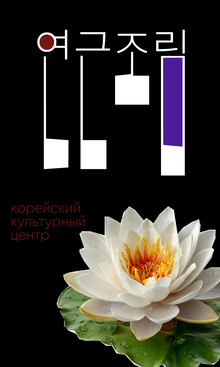
Проект представляет собой ребрендинг сайта и визуального языка Корейского культурного центра. Дизайн-система основана на пяти принципах: круг как главная фигура, пунктирные круги, контрастность (например, выход текста за пределы формы), бинарные оппозиции и белый цвет как основа корейского минимализма. Проект включает в себя кроссплатформенный веб-интерфейс (десктопная и мобильная версии), элементы городской навигации, наружную рекламу и сувенирную продукцию.
hsedesign
hsedesign.com is the digital ecosystem brought by HSE ART AND DESIGN SCHOOL. It combines a professional portfolio for designers — students, graduates, and professors — with an online educational platform and a hub that aggregates international competitions in creative industries, among other digital services. ... Show more
design
object design
art
fashion
environment
game design
illustration
animation
cgi
sound
all the directions
fabrika
We use cookies to improve the operation of the HSE website and to enhance its usability. More detailed information on the use of cookies can be fou...
Show more