Introduction
Being an international student means living between worlds. Between languages, between time zones, and almost always — between currencies. For a student arriving from Tanzania into Moscow, the problem is not just jet lag or homesickness. It is the very practical, very unglamorous reality of money. Specifically, which money. Which currency. Which exchange booth. Which rate is better today than it was yesterday. Russia has sanctions. That means Mastercard does not work. Visa does not work. The way most international students survive is by arriving with a large amount of cash — physically carrying it across borders — or by finding someone traveling in the right direction and asking them to bring it along. Neither of these options is particularly dignified. Neither of them is safe. And neither of them is something anyone should still be doing in 2026. Yet here we are. International students flying from Dar es Salaam to Moscow, with a layover in Istanbul or Dubai — each stop a different currency, each exchange booth a different rate, each transaction another layer of confusion. Tanzanian shillings to dollars.
Dollars to lira. Lira to rubles. By the time the final destination is reached, it is hard to keep track of what was spent, what was lost in conversion, and what is even left. And it is not just one student facing this. It is thousands of them — young people from Tanzania, Ethiopia, China, India — all running the same exhausting currency marathon every single time they travel. Every country brings a new currency. Every arrival brings the same problem.
Picture of different notes folded form all over the world
Changgy was born from exactly that frustration. It is a physical wallet — compact, simple, and built for the modern traveler — that solves the one thing no one has properly solved yet. Put one currency in. Take another out. No booths. No apps. No waiting. No unnecessary risk. Just the right money, in the right currency, exactly when it is needed. The visual research that follows explores the advertising tools used to bring Changgy to life — finding the language, the images, and the ideas that speak to everyone who has ever landed somewhere new and thought: now what?
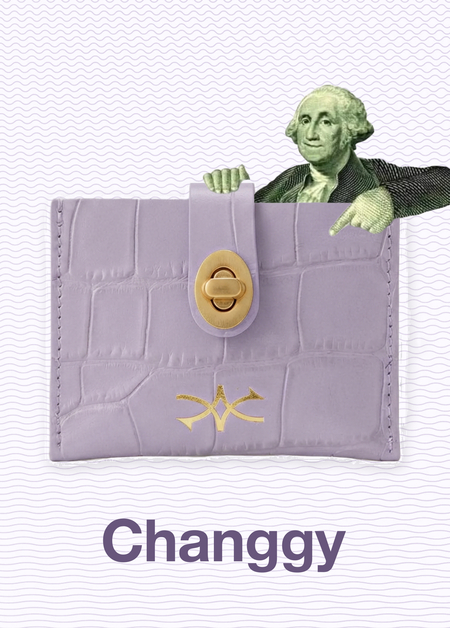
About Changgy
Changgy is a physical currency exchange wallet built for the modern traveler. The idea is disarmingly simple: put one currency in, take another out. No exchange booths, no apps, no waiting in queues, no confusion. Just a compact, pocket-sized wallet that carries the world’s currencies and makes the constant back-and-forth of international travel feel effortless. The essence of Changgy is freedom of movement — financial freedom specifically. The kind that lets a traveler land in a new country and feel immediately at home, not stranded at an exchange booth trying to calculate rates while their taxi meter is running.
Changgy is there to make currency exchange as simple and instinctive as reaching into your pocket. Its convenient, safe, modern, and transparent. No hidden rates. No unnecessary steps. No stress. Just cool, quick, and quietly confident.
The Changgy logo is built around two arrows moving in opposite directions — one going in, one coming out. It is the simplest possible visual representation of an exchange: something goes in, something different comes out.
Changgy logo
Changgy wallets
Changgy logo
The core target audience of Changgy is a Gen Z traveler. Not a tourist in the traditional sense — not someone with a printed itinerary and a guided tour. This is someone who moves. A student flying between continents for university. A young professional with clients in three different countries. A creative who works from wherever the Wi-Fi holds up. What they want is not complicated. They want things to work. They want to land somewhere new and not spend the first hour of their trip standing in a queue at a currency booth. They want to feel smart, prepared, and in control — even when everything around them is unfamiliar. Changgy was built for exactly that person.
No.1. Tool Product Advertising
Product advertising is one of the oldest and most straightforward tools in advertising. It does exactly what it says: it shows the product, explains what it does, and gives the consumer a reason to want it. The product is the hero, and everything around it exists to support that story. A well-executed product advertisement follows a simple structure — the product takes center stage, a headline communicates the core benefit, and a visual demonstrates that benefit in action.
A good example of product advertising is Rhode Skin’s campaign, where the product sits front and center, accompanied by a direct description of what it does — percentages, skin benefits, and ingredient callouts. No lifestyle, no story. Just the product and the proof.
Rhode Product Advertising
Another strong example is Bloom Nutrition, where the product is the hero, surrounded by clear benefit callouts pointing directly at what it does — «promotes lean muscle,» «supports cognitive health,» «1 scoop, unlimited benefits.» Straightforward, honest, and impossible to misunderstand.
Bloom product advertisement from their website
Bloom product advertisement
The Changgy product poster places the wallet at the center of the composition, with money flowing dramatically in and out — dollars, pounds, rubles, and gold coins scattered across the entire frame. The visual is deliberately exaggerated, inspired by the energy of Scrooge McDuck diving into his money pool. In reality currency exchange is a quiet transaction, but the exaggeration makes the core function of the wallet immediately clear. Different currencies flow in, different currencies flow out. The headline «Put in a dollar, pull out a pound» anchors the message, and three simple steps complete the picture — Drop in your cash. Pick your currency. Take your money.
Product advertisement tool sketch
No.2 Type-Led Advertising
Type-led advertising is a technique where text is not just words on a page — it becomes the visual itself. Instead of a headline sitting quietly above an image, the letters, words and phrases are shaped, stretched, stacked and arranged to form the entire composition. The idea was largely inspired by Soviet constructivist posters of the 1920s, where designers like Rodchenko and Mayakovsky treated typography as a powerful visual weapon — bold, dynamic and impossible to ignore. In modern advertising this approach does not have to look vintage or political. It simply means that the text carries the design, not the other way around.
Take a look at this iconic poster by Rodchenko and Mayakovsky, created for the Lengiz state publishing house in Leningrad. A woman shouts the word «КНИГИ» — Books — directly at the viewer, with bold geometric typography shooting out of her mouth like a visual megaphone. The text is not decoration here — it is the action. The word becomes the force, the movement, the entire message. This poster is widely considered one of the most important examples of constructivist advertising in history and a founding reference for what type-led advertising would become.
Books in All Branches of Knowledge, (Lengiz Publishing House Poster) Alexander Rodchenko & Vladimir Mayakovsky, 1924
A good example of type-led advertising is the SVA «Take It On» campaign by Sagmeister & Walsh, where the text is not placed on top of the image — it becomes part of the face itself. The words are painted and sculpted directly onto the skin of the subjects, turning the human face into a typographic canvas. The posters were created to advertise the School of Visual Arts — one of New York City’s most prestigious art and design institutions.
Take It On, School of Visual Arts (SVA) Posters, Stefan Sagmeister & Jessica Walsh, 2013
Take It On, In Situ — NYC Subway, Stefan Sagmeister & Jessica Walsh, 2013
In our case the poster uses the instantly recognizable silhouette of Scrooge McDuck with text placed directly inside his oversized top hat. The design is deliberately minimal — almost no graphic elements, just bold typography doing all the work. The headline reads: «You’re no Scrooge McDuck. But every currency in the world is yours.» Telling the audience that with the Changgy wallet they can have access to all the currencies in the world.
Type-Led Advertising Sketch
No.3. Tool Ogilvy Headlines
Ogilvy Headlines Named after David Ogilvy — one of the most influential figures in the history of advertising and founder of the agency Ogilvy & Mather — this technique is built on a simple but powerful idea: speak in the voice of the consumer. Instead of the brand talking about itself, the headline sounds like something a real person would think or say after using the product. It captures an honest, relatable moment — an emotion, a realisation, a thought — and puts it in quotes, as if the consumer is speaking directly to the reader. The result feels less like advertising and more like a conversation.
Yota’s «I’m on Yota because…» campaign is a textbook example of the Ogilvy technique in action. Real users were invited to complete the sentence in their own words, and the results were placed on billboards and digital screens across Russia, completely unfiltered. One user wrote: «I’m on Yota because there’s no ringtone playing instead of a dial tone.» The second image shows the sentence left deliberately incomplete — with a blinking cursor, as if someone is typing in real time — inviting the viewer to finish the thought themselves. The brand disappears entirely. The consumer becomes the advertisement.
«I’m on Yota Because…», Outdoor & Digital Campaign, Yota, 2014
«I’m on Yota Because…», Digital Format, Yota, 2014
A young Gen Z traveler sits at an outdoor café — suitcase beside her, Changgy wallet in one hand, croissant in the other. Completely unbothered. The headline captures exactly what she is thinking: «While everyone else was hunting for a currency exchange, I just ordered another croissant.» Changgy gave her back her time, and she spent it exactly the way she wanted.
Ogilvy Headlines Sketch
No.4. Tool Absurdism and Surrealism
Absurdism and Surrealism Absurdist and surrealist advertising works by placing something completely unexpected into the world of the product — an image, an idea, or a situation that has no logical reason to be there. The result is strange, surprising, and almost impossible to ignore. The point is not confusion — it is memorability. When something breaks the rules of normal logic, the brain pays attention. The product becomes associated with that unexpected feeling, making it far harder to forget than a straightforward advertisement ever could.
McDonald’s turned an ordinary pedestrian crossing into a giant fries box, making the yellow stripes of the crosswalk look like french fries spilling out of the iconic red packaging. Frontline took it even further — a giant dog printed on a shopping mall floor made every person walking above look like a flea crawling on its body. Both campaigns transform everyday environments into something completely unexpected, making the viewer stop, look twice and smile. That moment of surprise is exactly what absurdist advertising is designed to create.
Grapes and money
For this tool we were given a random object, in my case it was a grapevine. Two posters were created from it, each built around a different idea. The first plays on the natural language of fruit — ripeness and abundance — replacing the grapes with banknotes to suggest that every currency in the world is within easy reach. The second subverts the well-known saying «money doesn’t grow on trees» — by making it literally grow on a vine instead, in the form of gold and silver coins from different world currencies.
Absurdism and Surrealism Sketch
No.5. Tool Metaphor
Metaphor A metaphor in advertising replaces a direct description of the product with a comparison — one that communicates the same idea in a more visual, emotional, or surprising way. Instead of saying a product is fast, an advertisement might show a cheetah. Instead of saying a sauce is spicy, it might show a volcano. The power of metaphor is that it does not tell the consumer what to think — it shows them, and lets them feel it. When done well, a single image can communicate something that a paragraph of text never could.
Hibiki’s global campaign draws a direct metaphor between two ancient Japanese crafts — the making of a kimono and the blending of whisky. A master kimono artist from the historic house Chiso applies colour using the traditional yuzen technique, and every brushstroke, every fold, every carefully chosen shade is mirrored in the whisky itself. The deep purple tone of the kimono matches the colour of the Hibiki bottle’s label. The metaphor is simple but powerful — both are masterpieces that take a lifetime to perfect. The campaign stars Hibiki brand ambassador Anna Sawai, known for her role as Mariko in the series Shogun.
The Masterpiece of Japanese Artistry, global Brand Campaign, Hibiki by The House of Suntory, 2026
The poster is built around one of the most universally understood idioms for speed — «in the blink of an eye.» To make the metaphor visual, the entire composition is a collage of eyes — but not just any eyes. Every single eye in the image is taken directly from a different world banknote. The faces of presidents, monarchs and historical figures printed on currencies from around the world, all staring back at the viewer. The message is simple: in the time it takes to blink, Changgy has already changed your currency.
Metaphor Sketch
No.6. Tool Power of Word and Sign
Power of Word and Sign This technique is built on the idea of creating an exclusive language between a brand and its audience. The advertisement uses specific words, phrases, slang, symbols or references that only a particular group of people would immediately understand. To an outsider it might seem cryptic or even meaningless. But to the right person — the target audience — it feels like a secret handshake. It says: this is for you, you belong here. That sense of recognition and exclusivity is exactly what makes the brand magnetic.
Nike’s «Just Do It» campaign has always spoken in the exclusive language of those who refuse to give up. This film follows two-time Olympian Caster Semenya, and the entire script is built around a series of uncomfortable questions directed at the world: «Would it be easier for you if I wasn’t so fast? Would it be simpler if I stopped winning? Would you be more comfortable if I was less proud?» And then the answer lands: «That’s too bad. Because I was born to do this. When you are born to do it — just do it.» Three words that have always meant something to winners suddenly mean everything. The brand name never appears until the very end. It does not need to. The language already told you exactly who this is for.
What’s up world. Yeah, you. I’m Travis Scott. This is my McDonald’s order. Follow me. Here’s my quarter pounder with lettuce, pickles, onions, ketchup, mustard, and bacon. 0:1111 secondsYeah. Here’s my fries. Sometimes I do this. Then I dip them into barbecue sauce. 0:1818 secondsOh, yeah, And my Sprite. Same order since back in Houston. You could try too. Gotta go! The Travis Scott meal. 0:2626 secondsJust six dollars. Say Cactus Jack sent you.
The poster turns the brand name into a verb. «Landed. Changgy’d. Now slaying a new city.» — three words that tell the entire story of a Gen Z traveler arriving somewhere new. The target audience would immediately understand that «Changgy’d» means currencies exchanged, wallet sorted, ready to go. To anyone outside that circle it might raise an eyebrow. But to the right person — a young traveler who moves between countries and currencies — it feels like their own language. The word «slaying» adds another layer of young audience fluency.
Power of word and sign Sketch
No.7. Tool Extreme Consequences
Extreme Consequences Extreme consequences advertising asks one simple question: what would happen if everyone in the world used this product? And then answers it in the most exaggerated, over-the-top way possible. It takes the core benefit of the product and pushes it far beyond reality — to a point that is funny, absurd, or even slightly alarming. The exaggeration is the point. By showing the most extreme version of the product’s impact, the advertisement makes the actual benefit feel vivid, real and undeniable.
Evian’s «Roller Babies» campaign takes the product’s core promise — that Evian water supports your body’s youth — and pushes it to the most gloriously absurd extreme possible. Babies on roller skates perform jaw-dropping stunts in a city street, moving with the confidence and energy of professional athletes. The extreme consequence of drinking naturally pure, mineral-balanced water is not just feeling young — it is becoming so young you are literally a baby again. The ad went viral globally, accumulating over 50 million YouTube views and becoming one of the most watched advertisements in history at the time of its release.
«Roller Babies», Live Young Campaign, Evian, 2009
Chipotle’s «Back to the Start» is a perfect example of this. As the farmer walks through his factory farm, thought bubbles appear above his head — pills, chemical waste, confined animals unable to move. The extreme consequence of industrial farming scaled globally means medicating animals, polluting the environment and ultimately damaging human health. The film then flips it — one farmer chooses differently, returns to sustainable farming, and everything changes. It won the Grand Prix at Cannes Lions and went viral globally.
Wrigley’s 5 Gum took the extreme consequence of chewing a single piece of mint gum and pushed it into full sensory overload. A man chews the gum and is immediately pulled into a whole new world — dark, electric, overwhelming. Lightning, freezing temperatures, an entire universe of sensation triggered by one small piece of gum. The tagline says it all: «Stimulate your senses.» The ad became so iconic it turned into a meme, and the campaign ran for years across multiple flavours, each with its own extreme sensory universe.
Two posters, two versions of the same extreme consequence — a world where Changgy has become so universal that everything around it has changed. The first imagines a future where currency exchange booths no longer exist. They have been preserved behind glass in airport museums, labelled as historic artefacts — relics of a time before Changgy. A traveler walks past them without a second glance. The second takes it even further. If every currency is already in your pocket, what is the point of a border? The world map slowly fades and dissolves — boundaries between countries becoming irrelevant. One wallet. Every currency on earth. The borders existed because money was complicated. Changgy made it simple.
Extreme Consequences sketch
No.8. Tool Shock
Shock advertising deliberately breaks social norms, taboos, or boundaries to grab attention. It confronts the viewer with something unexpected, uncomfortable, or provocative — an image, a statement, or an idea that they would not normally encounter in everyday life. The goal is not to offend for the sake of it, but to create such a strong emotional reaction that the message becomes impossible to forget.
Skittles took a single product quality — softness — and made it genuinely disturbing. Three spots, three scenarios. A bald, half-man half-kangaroo hybrid with creepy little hands feeds teenagers sitting inside his pouch, one candy at a time. A giant slimy jellyfish performs a massage, its wet tentacles slapping against a man’s bare back while it cheerfully drops gummies into his mouth. A balloon dog drags its backside across a living room carpet, leaving a trail of whatever that is, while its owner sits completely unbothered eating her candy. The whole thing is accompanied by an ASMR sound design that makes every soft, squishy, gooey moment feel even more uncomfortable than it already is. The shock is not in violence or taboo — it is in the deeply unsettling feeling that something is very wrong, and nobody in the room seems to notice.
«Smoking Balcony» — Anti-Smoking Campaign, 2007. A man walks towards a smoking balcony packed with people. The moment he steps close, the entire balcony collapses — everyone on it falls. He stands there in shock, looks at the cigarette in his hand, and throws it away. The screen reads: «Warning: smoking can seriously damage your health.» Short, brutal, and impossible to misread. The shock is not in graphic imagery — it is in the sudden, unexpected consequence that nobody saw coming.
Shock sketch
No.9. Tool Storytelling
Storytelling Every great advertisement tells a story. Storytelling in advertising means giving the viewer a character to follow, a problem to care about, and a resolution that involves the product. It is not about listing features or benefits — it is about making the audience feel something. The hero of the story does not have to be the target audience. In fact, the most memorable advertising stories often feature unexpected characters in surprising situations. What matters is that by the end, the viewer has experienced something — and the product was part of that experience.
BMW’s «Teleportation» commercial is a perfect example of this. Scientists have invented teleportation — the ability to arrive anywhere instantly. Given the choice between teleporting and driving a BMW, every person chooses the BMW. That is the entire story. No features listed, no engine specs, no price. Just a simple narrative that communicates one thing: driving a BMW is not about getting somewhere. It is about the experience of getting there. The viewer follows the story, feels the choice, and by the end understands the product better than any specification sheet could ever explain.
In our sketch the hero is Mama Ngozi — a 70-year-old Nigerian grandmother who has never left her village and has no idea different currencies exist. She ignores every warning at the airport, tries to pay for rice in Tokyo with naira, and is convinced the cashier simply cannot count. The moment her grandson pulls out the Changgy wallet and yen appears from nowhere, she refuses to give it back. The story never explains the product. It just shows what life looks like without it — and then with it.
Story telling sketch
Final Campaign
Out of all ten advertising tools explored in this research, metaphor was chosen as the foundation for the final Changgy campaign. The reason is simple — Changgy’s core promise is speed and ease. A metaphor communicates that instantly, without explanation, without a single word of technical language. The blink of an eye is something every person in every country understands. It crosses every language barrier. For a brand built around international travel and multiple currencies, that universality is everything.
Conclusion
This visual research set out to explore ten advertising tools and find the most effective language for Changgy — a product that is simple, modern and built for a generation that moves fast and expects everything to work instantly. Working through each tool revealed something important: the most powerful advertising does not explain the product. It makes the viewer feel it. The metaphor of the blink captures Changgy’s core promise better than any technical description ever could — and that is exactly what the final campaign is built around. Every sketch, every poster and every example in this research pointed toward the same conclusion: Changgy does not need to convince anyone. It just needs to show up in the right moment, in the right language, and let the idea do the rest.
Bloom Nutrition. «Product Advertising Campaign» [Electronic Resource] // Target. URL: https://www.target.com/b/bloom-nutrition/-/N-q643leap7ew (accessed: 28.05.26)
Museum Studies Abroad. «What is Constructivism: Materials & History» [Electronic Resource] // Museum Studies Abroad. URL: https://museumstudiesabroad.org/what-constructivism-materials-history/ (accessed: 28.05.26)
Sagmeister & Walsh. «Take It On — SVA Posters» [Electronic Resource] // Sagmeister.com. URL: https://sagmeister.com/work/take-it-on-sva-posters/ (accessed: 28.05.26)
ADPASS. «From Kimono to Whisky — Hibiki by The House of Suntory» [Electronic Resource] // ADPASS. URL: https://adpass.ru/hibiki-the-house-of-suntory/ (accessed: 28.05.26)
Chipotle Mexican Grill. «Back to the Start» [Electronic Resource] // YouTube. URL: https://www.youtube.com/watch?v=BpjMVDl6Yp4 (accessed: 28.05.26)
Nike. «Just Do It: Caster Semenya» [Electronic Resource] // YouTube. URL: https://www.youtube.com/watch?v=RP6eZAfO0Yg (accessed: 28.05.26)
McDonald’s x Travis Scott. «The Travis Scott Meal» [Electronic Resource] // YouTube. URL: https://www.youtube.com/watch?v=eEDTN3cgjLs (accessed: 28.05.26)
Evian. «Roller Babies — Live Young Campaign» [Electronic Resource] // YouTube. URL: https://www.youtube.com/watch?v=S1zXGWK_knQ (accessed: 28.05.26)
Skittles. «But They’re Soft Campaign» [Electronic Resource] // Ads of the World. URL: https://www.adsoftheworld.com/campaigns/skittles-but-they-re-soft (accessed: 28.05.26)
Bloom Nutrition. «Product Campaign Image» [Electronic Resource] // Target. URL: https://target.scene7.com/is/image/Target/GUEST_53ebf6fb-cda1-4b1c-aece-0c8f190056e0 (accessed: 28.05.26)
Rhode Skin. «Product Campaign Image» [Electronic Resource] // Peeky. URL: https://static.peeky.com/_image/2560x/0e5e78f5c1117db1d14c91eb873072ec.jpg (accessed: 28.05.26)
Rodchenko & Mayakovsky. «Constructivist Advertising Poster» [Electronic Resource] // Museum Studies Abroad. URL: https://museumstudiesabroad.org/wp-content/uploads/2021/07/ro6vsdofawj211-scaled.jpg.webp (accessed: 28.05.26)
Rodchenko, A. «Lengiz Publishing House Poster» [Electronic Resource] // Museum of Modern Art. URL: https://www.moma.org/collection/works/217713 (accessed: 28.05.26)
The House of Suntory. «Hibiki — The Masterpiece of Japanese Artistry Campaign Image» [Electronic Resource] // ADPASS. URL: https://adpass.ru/wp-content/uploads/2026/05/image-88e82cd2-02e1-456e-845f-ef61cd277229-1176x617.jpg (accessed: 28.05.26)
McDonald’s x Travis Scott. «The Travis Scott Meal — Campaign Video» [Electronic Resource] // YouTube. URL: https://www.youtube.com/watch?v=eEDTN3cgjLs (accessed: 28.05.26)


