
List of contents
- How communication theory works in the field of design
- Presentation of brand for a general audience
- Presentation of brand for a professional audience
- Explanation of presentation creation tools
- Sources
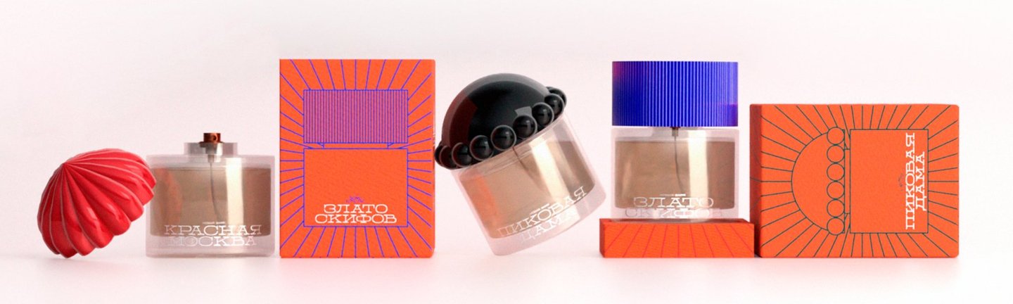
The Novaya Zarya perfume line
How communication theory works in the field of design
Communication theory is a way of perceiving design as a process of making sense, and design is not a visual design, but a form of interaction subject to the same laws as interpersonal, group or mass communication. Any design object (brand, identity, book, interface, or art project) acts as a message that is addressed to the audience and embedded in a specific media text.
Visual communication can work both through rational reflection and through peripheral signals (aesthetics, atmosphere, emotional tone), as shown by rhetorical approaches and the Elaboration Likelihood Model. In addition to the content, the meaning is formed by the medium itself: websites, social networks, printed media or exhibition spaces create different communication conditions and direct the audience’s attention in different ways.
Communication is a process of creating meaning, rather than simply conveying information.
The meaning is not embedded in the brand’s visual, it arises in the process of interaction between the object, the audience and the environment. Here, the designer acts as a communicator who creates the conditions for interpretation.
The audience is an active participant in communication, choosing, interpreting and reinterpreting messages, which is especially evident in product design, where users are directly involved in brand formation through interaction, feedback and distribution.
The critical tradition of communication allows us to consider design as part of a broader social order. Visual languages, brands, and aesthetic solutions are not neutral: they convey values, norms, and notions of «normal» and «desirable.»
Based on the above, communication theory provides an analytical and critical foundation for design practice. In this project, it is used as the basis for a fictional brand, building different types of communication with the audience and choosing visual and rhetorical strategies.
Presentation of brand for a general audience
Logo
Novaya Zarya is a Russian perfume brand founded in 1992. Initially, it was created as a brand of affordable and high-quality perfumes, whose images are drawn to Russian culture, history and nature.
Merch Novaya zarya
The brand’s fragrances have always worked on emotions and memories: they recognized the motifs of the forest, earth, flowers, romantic and warm associations familiar to many since childhood.
Over time, the brand became part of everyday culture and memory, but by 2025, Novaya Zarya had lost its relevance for the modern market. Despite this, the brand’s range retains many expressive and high-quality fragrances that are still able to compete with modern products, but have been forgotten due to outdated identity, positioning and communication.
We want to remind you about the brand, which is associated with childhood, family memory and the past, but to rethink it in the context of modernity. In recent years, nostalgia and interest in retro paraphernalia have become more significant for a younger audience: the past is no longer associated with something mossy and gloomy, it is romanticized and turns into a source of inspiration.
The updated Novaya Zarya is a brand that respects its history but speaks a modern language. Bright colors, graphics and new positioning make it possible to preserve the Russian identity, getting rid of the image of grandmother’s spirits.
Merch Novaya zarya
The idea of rebranding is based around the principle of «new forgotten old».
The Novaya Zarya perfume line
The rebranding is aimed at attracting a new audience: creative youth and modern confident women who value individuality, history, culture and emotional connection with the brand. The main message is to show that Russia has developed a perfumery tradition, and Novaya Zarya can be relevant, stylish and desirable today.
Presentation of brand for a professional audience
Perfume bottle Krasnaya Moskva
Novaya Zarya perfume blotters
The visual identity of the Novaya Zarya brand is being built as an integral communication system based on a semiotic and socio-cultural reinterpretation of the brand’s heritage. Each design solution functions as a sign, forming new meanings around a familiar image and guiding the audience’s interpretation towards nostalgia, updated through the prism of modernity.
Novaya Zarya packages
The brand consciously works with collective memory, transforming the «good old» into an actual visual language.
Perfume bottle Pikovaya Dama
Gift certificate Novaya Zarya
The color palette is based on bright, open shades. The key color becomes a rich, almost neon orange — a direct reference to dawn as a symbol of beginning, renewal and hope. It enhances the emotional expressiveness of the brand and makes it visible in the modern visual field. Additional colors — red, blue and emerald green — expand the palette, forming a dynamic and lively system. In a semiotic sense, these colors work as markers of energy, sincerity, and reliability, creating a strong emotional connection.
Shaping and compositional solutions balance stability and flexibility. Clear but not rigid shapes create a sense of structure while maintaining visual lightness and accessibility. This approach allows the brand to distance itself from archaism, while maintaining its connection with the historical context.
The logo is a symbolic sign. The simplified rays of the setting sun are a metaphor for memory, warmth, and generational continuity. This image simultaneously appeals to the past and is read in an actual visual environment, creating a common symbolic space for different age groups.
Logo



