
CONTENTS
- Introduction
- Communication Channels
- Theoretical Framework
- Analysis
- Conclusion & Recommendations
INTRODUCTION
Forced Fun Community (FFC) is a Saint Petersburg fashion brand whose flagship product is the statement scarf — knitted and printed pieces carrying design-driven, pattern-heavy artwork across various collections.
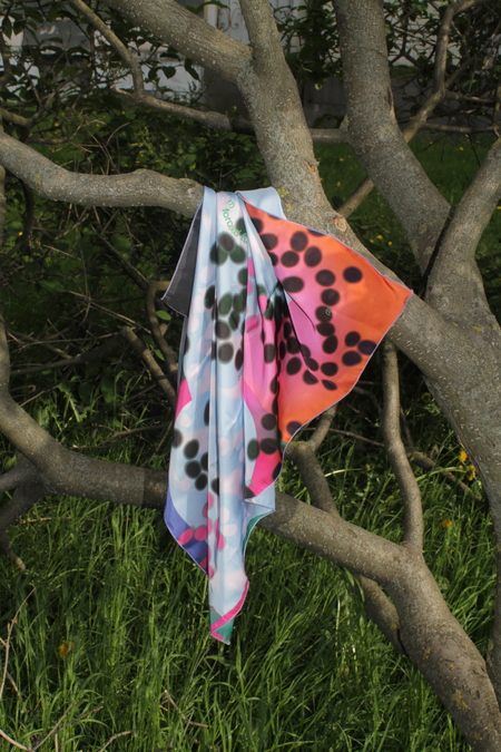

FFC Items from the site.
The scarves are designed to be used in any way you like, and they also produce picnic blankets and even branded lighters. The project’s signature features are vibrant, original prints applied to washed silk, as well as equally vibrant collaborations, such as with the Turfutur project or illustrator Masha Bogatova. The graphics on the scarves convey an uncompromising optimism that each of us needs during gloomy weather conditions.
«We bring vibrant colors to life to stun you. Resistance is futile,» states the F.F.C. website. And we have no reason not to believe it.
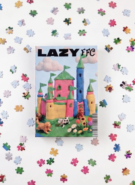

FFC Items from the site.
But the scarf is only the surface. FFC positions itself less as a label and more as a cult with a dress code. The brand’s self-description is half-manifesto, half-joke: it promises to «daze you» with bright colour, declares that «resistance is futile, ” and invites you to „join the cult.“ The fun is named as forced on purpose — irony is the entry ticket, not a bug. The second half of the name is structural. „Community“ is a literal platform inside the brand: a roster of conceptually aligned local authors — ДАР, DON’T DROP THE GLASS, ДАРСАГ, RUBANN, REDHOTCHILILAVA, FLUFFY BAGS, BLANNIES and LOUTIQUE — described as „talented authors working at the intersection of art and design.“ FFC sells its own scarves and simultaneously hosts a small ecosystem of brands close to it in spirit.
At its core, FFC’s positioning rests on three things. The product is design-led scarves — warm knits and printed pieces — extended by puzzles, candies and small goods that widen the visual world beyond the flagship object. The posture is ironic maximalism: loud colour, deadpan copy and an in-joke tone that treats «fun» as a half-serious obligation. And the architecture is unusual — a single brand that doubles as a curated platform for eight adjacent local micro-brands.
Target audience: Young, design-literate Saint Petersburg urbanites — students, creatives, scene-adjacent twenty-somethings who read irony fluently. They don’t buy a scarf for warmth; they buy a wearable signal that they get the joke and belong to the in-group. The audience is also online-native: their primary relationship with FFC happens on Instagram, not in a store.
COMMUNICATION CHANNELS
FFC runs a lean digital footprint built around one loud public field: Instagram. The Tilda-built website (forcedfuncommunity.ru) is the storefront and the manifesto; Instagram* (@forcedfun.community) is the voice, the joke, and the engine of community.
- Meta and Instragram are designated as extremist organisations on the territory of Russian Federation
Instagram is Forced Fun Community’s main communication channel and the one that generates by far the most engagement. The brand has tested other formats — a Telegram channel among them — but fashion- and design-oriented audiences have shown little appetite for the platform, since it privileges text narratives over the visual-first feed that FFC’s work depends on. So the brand keeps returning to Instagram, where image and irony can do the talking. The tone of voice sets everything else. FFC speaks in English-forward, lowercase, deadpan lines that perform irony rather than describe product. The brand never sells earnestly; it under-sells, dares, and winks. «Resistance is futile,» «join the cult» — the copy treats the audience as already in on the joke, and getting the joke is the price of entry. This voice is consistent across every format, which is what makes the feed read instantly as FFC regardless of what’s in the frame.
The structure of content follows from that voice. The feed alternates between three modes that reinforce each other: scroll-stopping product imagery that establishes the visual signature, ironic short-form video that performs the «forced fun» thesis, and collaboration content that extends the brand’s world into the wider Saint Petersburg scene. None of these is purely promotional — each one is doing communicative work, building the in-group rather than advertising at it. Within that structure, the photosets carry the brand’s visual identity. They’re high-saturation and pattern-dense, built to stop the scroll and read instantly as «FFC» before a viewer even registers the product. This is where the scarf functions most clearly as a sign: the imagery signals authored design and bright-colour refusal of muted «good taste,» coding the wearer as someone who belongs. The ironic AI-generated Reels are the sharpest move. FFC leans into AI imagery deliberately — the slightly-wrong, uncanny, obviously-synthetic aesthetic becomes part of the joke, paired with short deadpan captions. The «forced» in forced fun is made visible in the medium itself: by choosing manufactured imagery, the brand says «our fun is synthetic, and we know it,» and the audience reads that self-awareness as a kind of honesty.
Social media grid @forcedfuncommunity
Collaborations then chain that world outward. Partnerships with local content creators, with the comedy platform Антон тут рядом, and with neighbourhood cafes like LU.CO let other trusted voices repeat and extend the brand’s fantasy. Each collab is a node where the shared vision reaches a new audience already primed to believe the partner — distribution and credibility in one move, rather than ordinary promo.
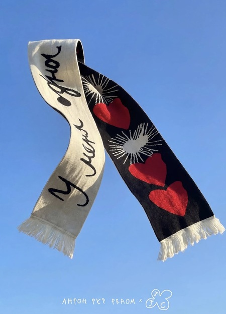
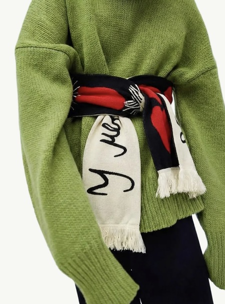
Collaboration Антон Тут Рядом × FFC
Collaborations are Forced Fun Community’s sharpest communication tool.Collaborations are Forced Fun Community’s sharpest communication tool. Rather than buying reach through conventional advertising, the brand grows by partnering with voices its audience already trusts — and the results show up directly in engagement and, more tellingly, in conversion. The audience buys when they see collabs, because a collab signals relevance: proof that the brand is embedded in a world they already belong to.

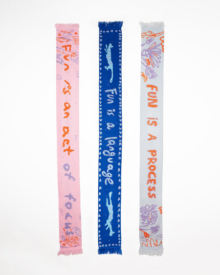
Collaboration FFC x Lera Smirnova
The range of partners is what makes it work. Collaborations with Blannies, a jacket brand, and with a local puzzle brand extend FFC beyond the scarf into adjacent objects, showing the brand as a node in a wider design ecosystem rather than a single-product label. Working with local content creators and artists folds FFC into the Saint Petersburg creative scene, so the brand reads as part of the community instead of advertising at it. And collaborations with photographers raise the visual register of the feed itself, producing the high-quality imagery that the scroll-stopping, sign-driven aesthetic depends on. What ties these together is relevance. Each collaboration places the brand inside a context the audience already cares about — a jacket they’d wear, a puzzle they’d own, a creator they follow, a photographer whose eye they trust — and that contextual fit is what converts attention into purchase. The collabs aren’t promotion bolted onto the product; they’re the mechanism by which the audience recognises the brand as theirs and acts on it.
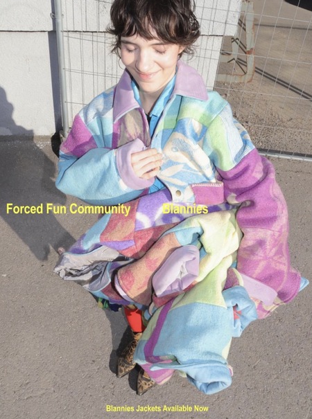

Collaboration Blannies × FFC
THEORETICAL FRAMEWORK
To analyse FFC’s communication we use two complementary theories from Craig’s traditions: the Semiotic tradition (the scarf and the brand world as a system of signs) and the Sociocultural / Symbolic Convergence tradition (the «community» as a shared rhetorical vision built through performed irony).
Theory 1 — Semiotics: Communication as the production and exchange of signs. FFC’s product is barely about textile and almost entirely about meaning. The scarf is a signifier; what it signifies is taste, irony-literacy, and membership. Colour, pattern, the deliberately «off» AI image, and the word cult are all coded signals the right audience decodes instantly.

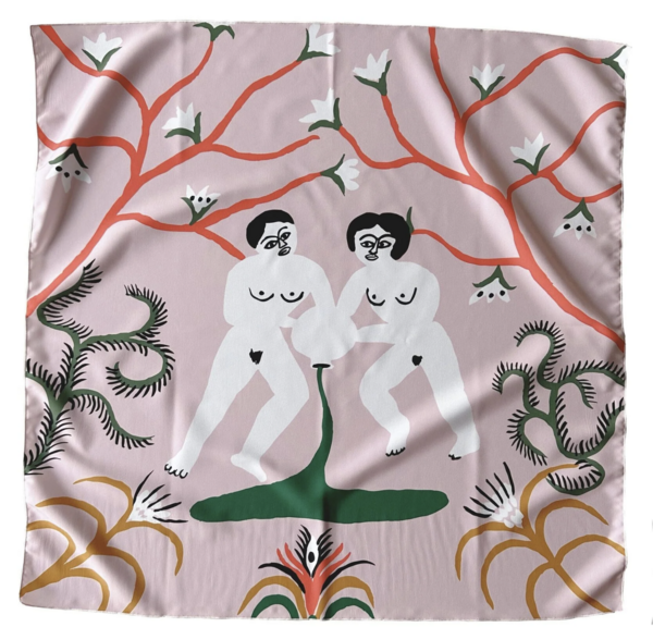
Collaboration FFC x Alisa Gvozdeva
Theory 2 — Symbolic Convergence Theory (Bormann): Groups cohere around shared fantasy themes that build a common rhetorical vision. FFC’s fantasy theme is «the cult of forced fun» — a half-serious mythology of bright colour as compulsion. When followers repeat the in-jokes, wear the scarves, and tag the brand, they chain out that fantasy and converge into a community that shares one reality.

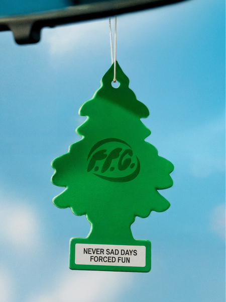
FFC item «Funny Tree»
The two pair cleanly: semiotics explains how each object means; symbolic convergence explains how those meanings bind people into a «we.» Supporting concepts — McLuhan’s medium-as-message (the AI aesthetic is the message) and the Narrative Paradigm (the brand tells a story rather than listing features) — are used where relevant.



