Communication theory in the field of design
«Communication study focuses on how people use messages to generate meanings within and across various contexts, cultures, channels and media.» (Human communication; C. Vleugels; [2])
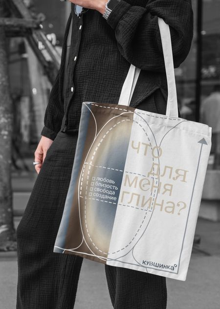
Final products of the brand
The impact of brand-to-publicity communication on the success of a project cannot be overemphasized. Design is a very essential part of this process of communication because it is the sender of communicative messages. Design uses visual language, symbols, colors, and shapes to convey meaning to the receiver of these messages, which is the brand audience or client. Effective visual communication cannot be obtained without proper knowledge of the context of the targeted audience, which includes cultural, social, and generational attributes.
There are certain aspects of communication theory that are practiced in design. In a socio-cultural perspective, design is used as a means of creating as well as reproducing meaning, which helps interact with culture, thus influencing the user’s understanding of it in a symbolic environment with a familiar artifact. In that case, a designer is capable of developing an identity, logo, or even a pattern that is founded on certain cultural traditions.
The semiotic theory appears in design as a system of signs that include color, texture, type, and composition, which are basically codes that need interpretation in order to decode a message.
In every image that is produced by designers, a story is being told, which is where the narrative paradigm is introduced. Design objects, whether a poster or a website, do not just convey information; they are used to immerse the audience within a story, creating an emotion.
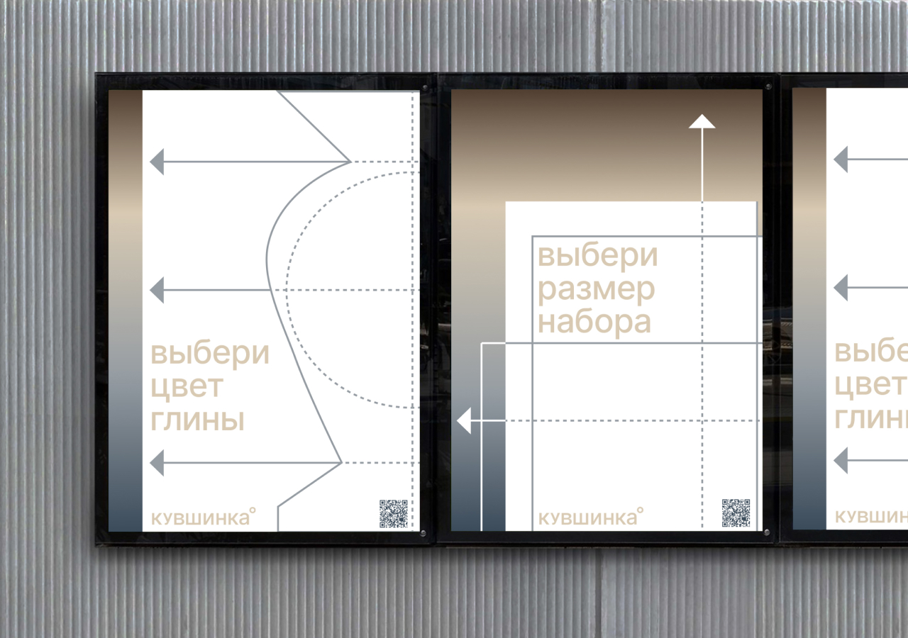
Posters as an outdoor way to communicate with audience
Social media design encodes an additional general image and a reference to the connection
Lastly, some elements of critical theory appear in relation to design challenges of dominant aesthetics. For instance, when certain styles, such as experimentation, are introduced, they might result in the rejection of the norm, but there are instances where such design challenges result in a trending movement.
The cybernetic theory is also evident in the design of interfaces and navigation, in which structure, hierarchy, message clarity, and awareness of feedback are essential factors in reaching goals.
Social psychological theory emerges as a function of user-centered design, which focuses on predicting reactions and emphasizes the influence of visual elements on attitudes and actions. This works especially well with color: muted colors calm the user, setting them in a measured mood, while bright, aggressive hues, on the contrary, encourage action. For example, discount messages are colored red or yellow, evoking a desire to purchase the product.
The rhetorical theory is also visible in the realm of brand design and advertisement, where design is exercised through the use of persuasion, appeals, as well as strategic positioning within a particular context. Graphic components serve as arguments, which position the viewer in relation to a set of beliefs, values, or ideologies. This strengthens the notion that visual communication is goal-oriented.
Navigation system combines usage of visual elements with message clarity of the message for audience.
Design is essentially created for human use, which means that the degree of engagement, responses, and feelings generated by a design product become integral to Social Exchange Theory (SET). In the realm of media communication, design facilitates the enhancement of a message structure by eliminating noise in information. In the theory of media ecology, which has been put forwarded by Marshall McLuhan, «the medium is the message,» (Understanding Media: The Extensions of Man; Marshall McLuhan; [3]), which indicates that the design of the media is as significant as the content message. This indicates that in media design, design is not merely a passive presentation tool but is actively part of the process of communication, which alters the viewer’s interpretation of information.
In addition, the principles of the interpersonal communication theory are explicitly realized within design, which is centered on relationship-building with the audience. The visual identity, tone of voice, as well as interactive components of a brand are aimed at recreating the nature of interpersonal communication—dialogue, personalized communication, and intimacy. The visual identity, user engagement, as well as mechanisms for receiving feedback, are used by a brand in order to «talk» with the audience, which brings about the establishment of a sense of trust and identification. In such a situation, design is considered to be a communicative tool that is not merely a presentation tool, but actively takes part in relationship-building involving the brand and the audience.
Example of communication with the audience through brand products
Presentation of your brand for a general audience
In the hustle of people’s daily routine, it is very common to lose connection with ourselves, rush for results and forget about the process. We invite you to take a deep breath, reconnect with matter, nature, and your own state of being.
Kuvshinka is a studio of ceramics and pottery which acts as a place of tranquillity, comfort and free creativity. We are located in a comfortable spot in Saint-Petersburg.
Our goal is to explore clay as a living material together with our guests, learn the basics of hand-building and wheel-throwing, and unite in creating objects without seeking perfection. At Kuvshinka, we think that beauty is natural, and into the trace of a hand and the uniqueness of a process.
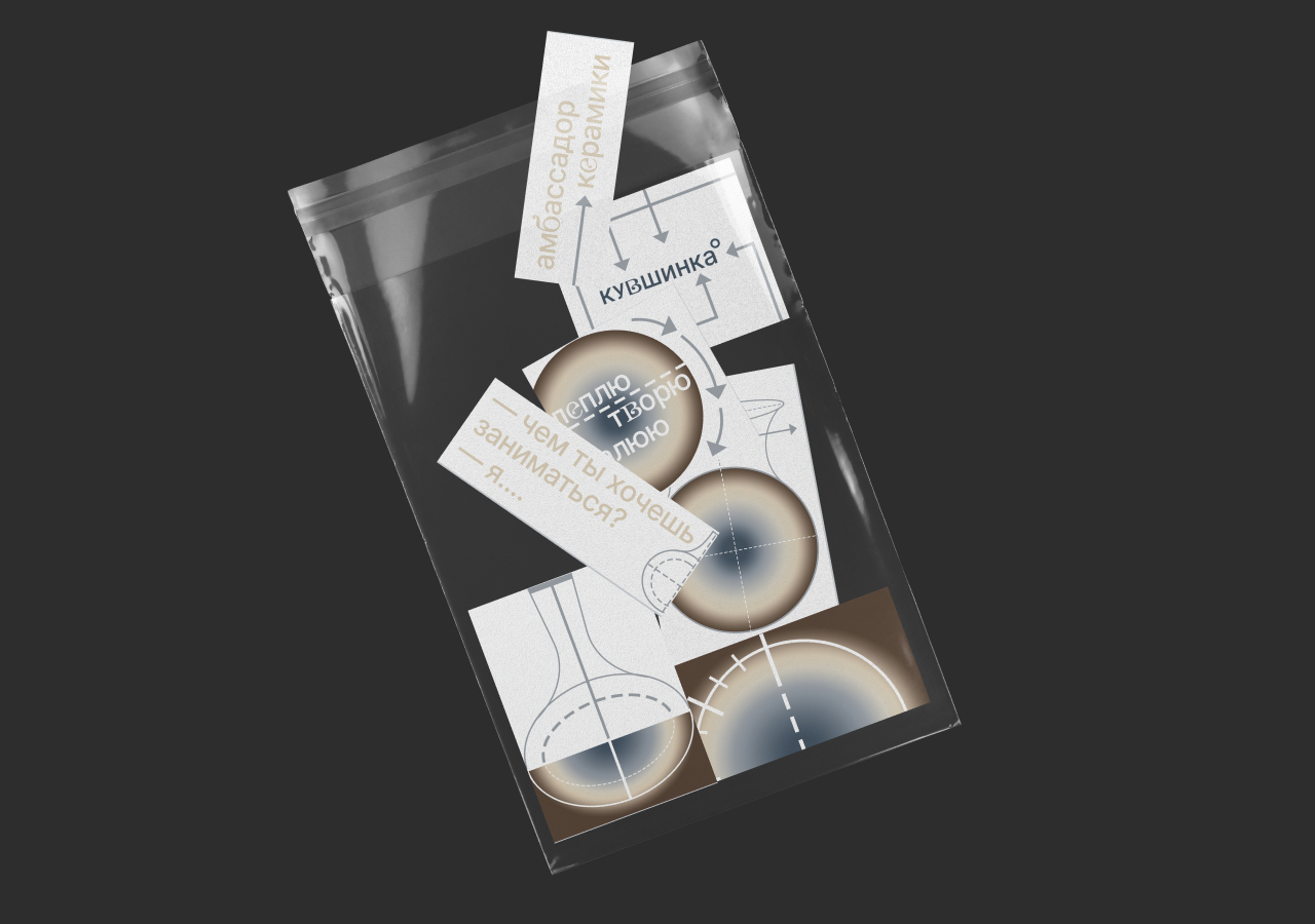

Common visual elements in different types of brand products
Kuvshinka is a zone of calm, comfort and free creative expression. At our place, we and our guests discover clay as a material which is connected with life and process. We see that beauty is in essence found in natural imperfect forms, calm colors and the uniqueness of each process.
We draw inspiration from the ceramic traditions of Southeast Asia, where the craft is integrated into everyday life. It builds a connection with nature and balances with inner self. Traditions honour calmness, material honesty and handwork.
With our brand we present principles of working with clay through visual schemes and step-by-step instructions, making them easy to understand. We don’t use complicated language, requirements or «right and wrong» terms. On the contrary, we use rather simple and friendly structures, and intuitive explanations which creates understanding for our guests. We want the first touch with clay to feel safe, inviting and captivating for you.
Your curiosity and inspiration should come before fear and experimentation should feel natural.
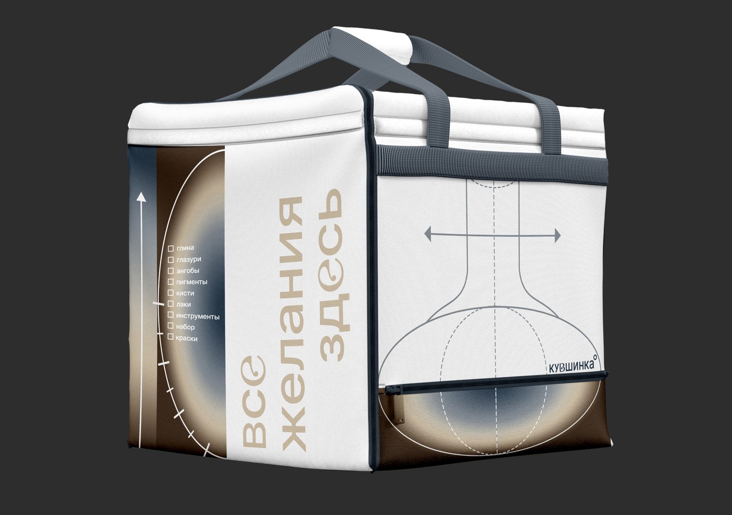
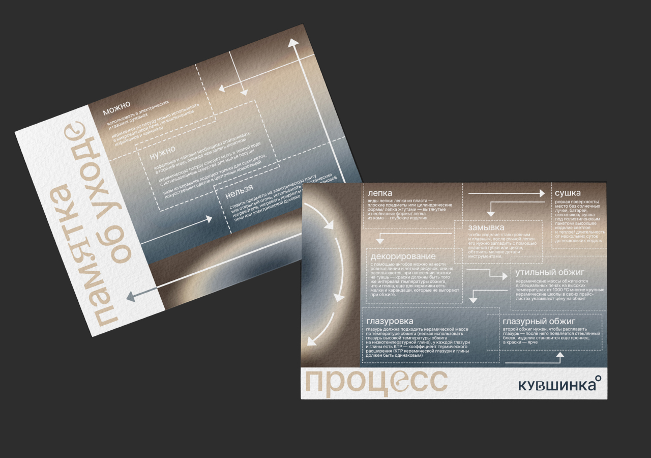

Brand uses simple visual schemes and natural colours to create comfortable explanation and feeling of safety while customer interacts with the brand’s products
In Kuvshinka creativity becomes a source of harmony and new inspiration when it follows nature, not rules
Presentation of your brand for a professional audience
The concept of the Kuvshinka brand is dedicated to clay as a natural mediator between customer and his inner state. Clay is seen not just as a material, but also as a process, which is slow and tactile, that can produce calm, focus and creative confidence.
Design of Kuvshinka construction circumvents uses geometry and free forms, mirroring the brand’s orientation towards free creation, imperfection, and material sensitivity. The malleability reflects the handmade ceramic forms where no piece is alike, but rather unique.
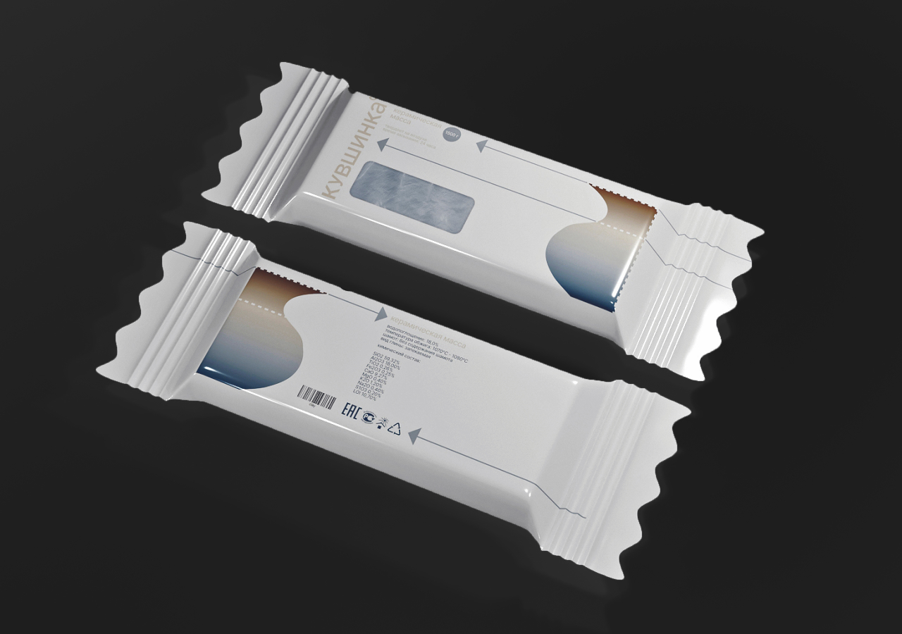
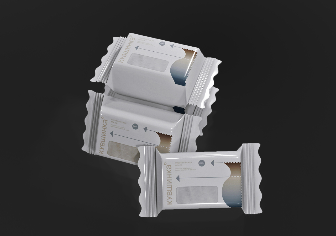
Brand uses simple geometry to create atmosphere of calm and concentrate customer on the process and creativity. We also pay attention to the texture of the clay and tactility
The colors used will be drawing from natural and earthy colors related to clay. The use of muted and calm colors creates a sense of equilibrium and visual comfort with the surrounding environment. The limited color palette supports the brand’s image as a place for calm concentration rather than visual stimulation. Color serves as a backdrop for experience rather than as the main means of expression.
Typography plays a supporting role within the identity system. A neutral, readable typeface is chosen to maintain clarity and accessibility, ensuring that informational content does not compete with the material aspects of the brand. Typographic hierarchy is guiding the viewer without imposing strict visual control. This approach aligns with the brand’s educational mission — to explain and guide without intimidating or overwhelming the user.
Identity system prioritizes openness and rhythm. Clear hierarchy helps to reduces visual noise. Compositional decisions are particularly important for a studio environment, where design functions as a backdrop for creative practice and learning rather than as a focal point demanding constant attention.
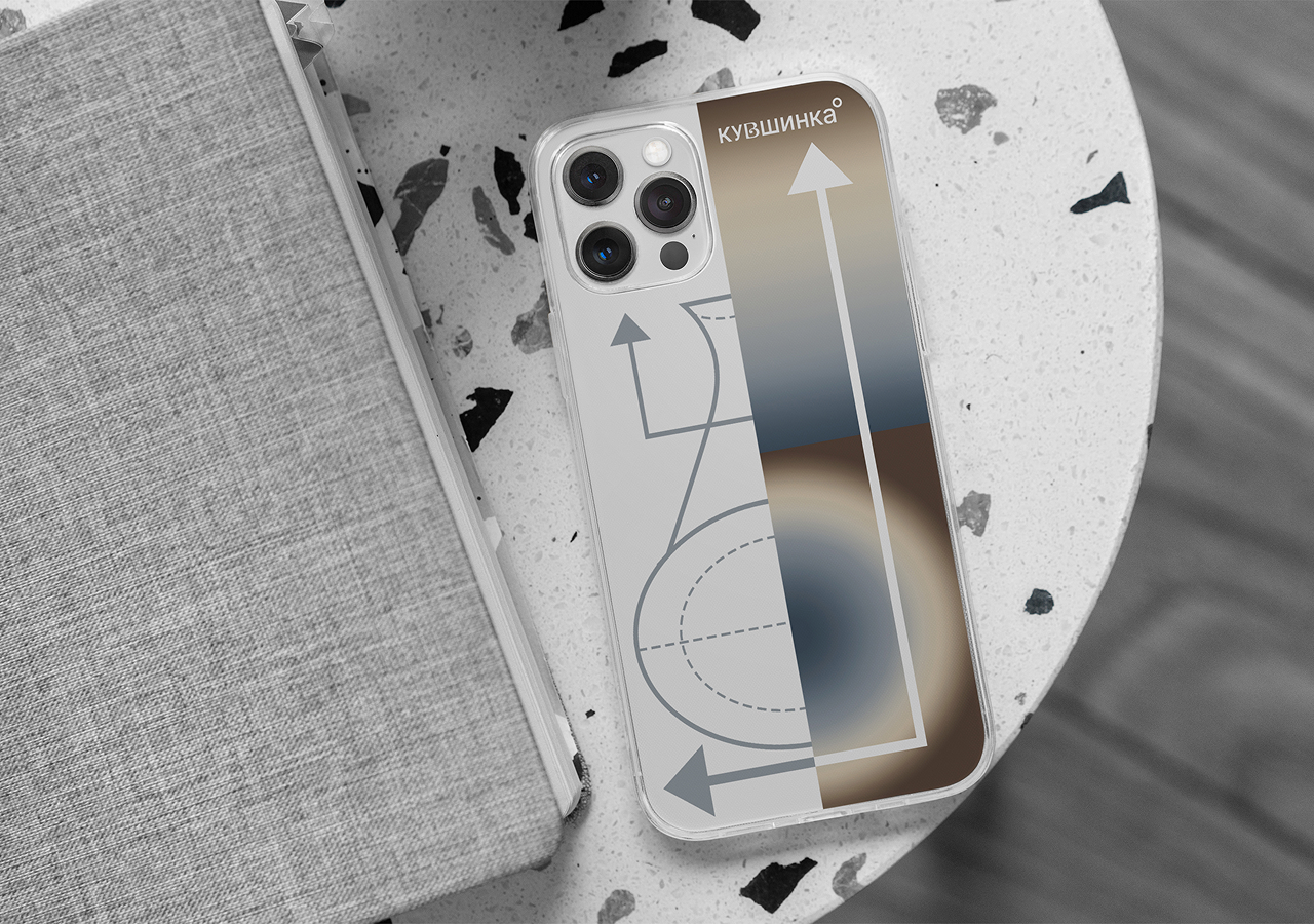

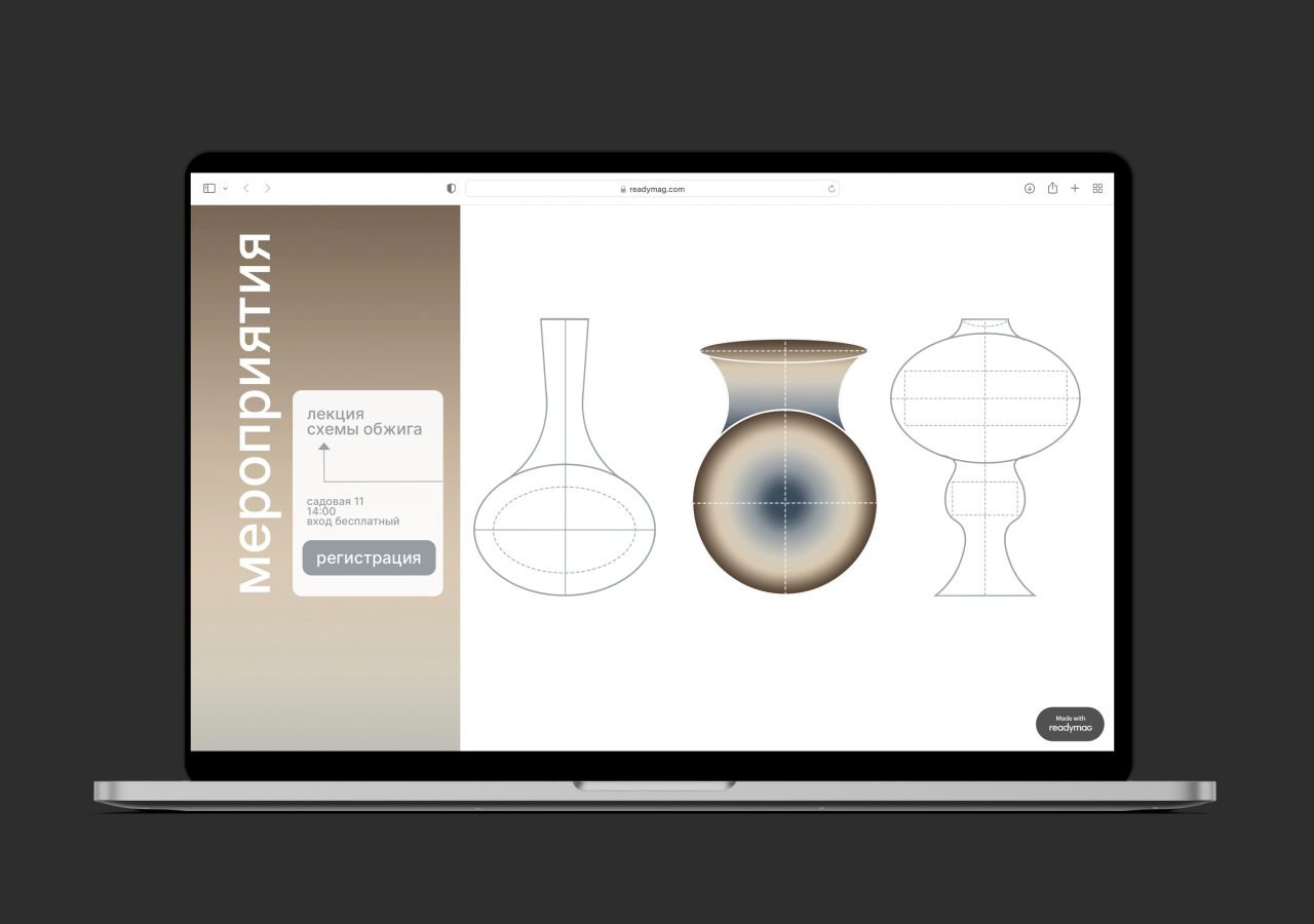
In different brand’s products we rely on rhythm and create simple system with visual constants for customer to concentrate on main information
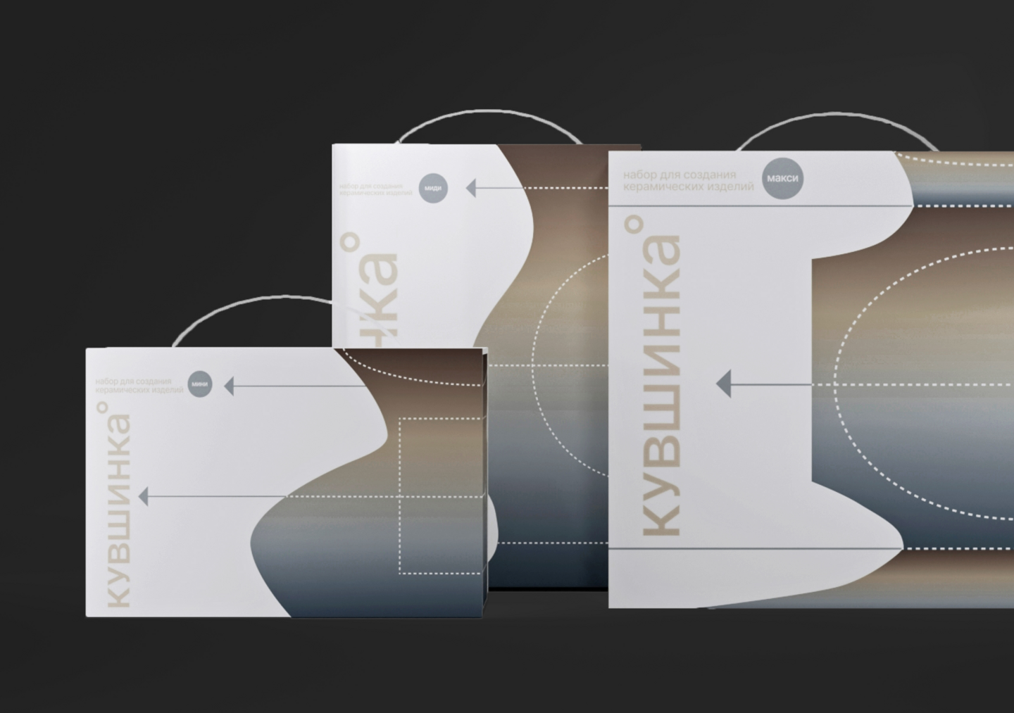
The packaging design continues and materializes the brand’s visual principles. It is conceived as an extension of the studio experience, something that accompanies the user beyond the physical space of Kuvshinka. Packaging forms are simple and functional, emphasizing usability, high effectivity while maintaining an organic, handcrafted feel.
Functionality play a key role in the packaging system of Kuvshinka. The packaging is designed to be intuitive and easy to use, supporting clear interaction and practical everyday handling. Its structure prioritizes clarity of information, allowing users to focus on the creative process rather than on navigating complex or distracting packaging solutions. Functionality here is understood as part of communication: the way packaging opens and organizes content contributes to a sense of calm and reliability.
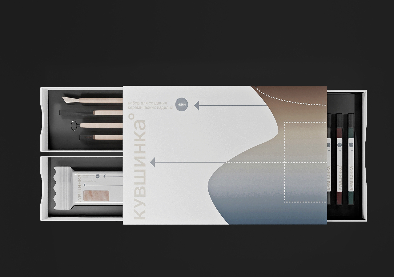
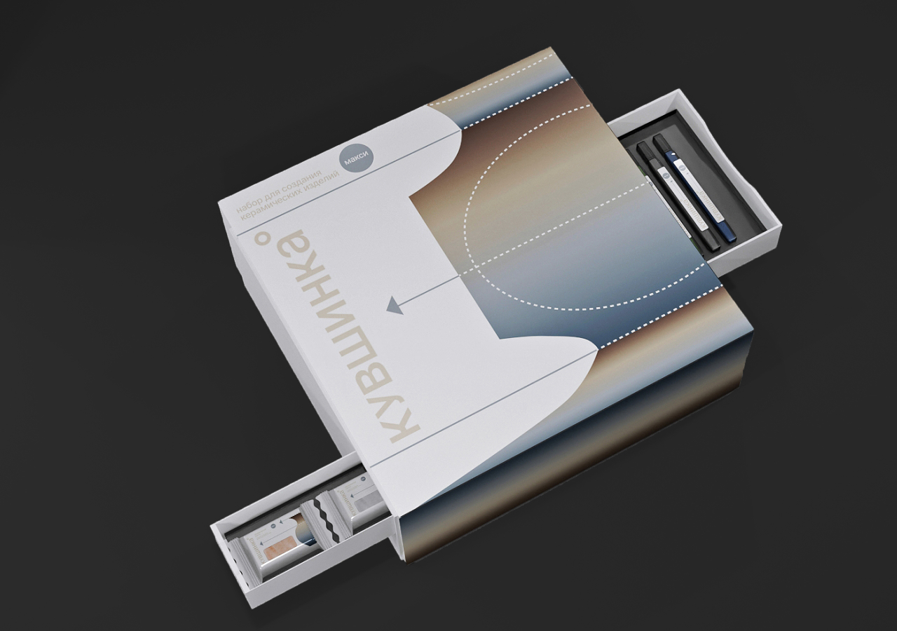
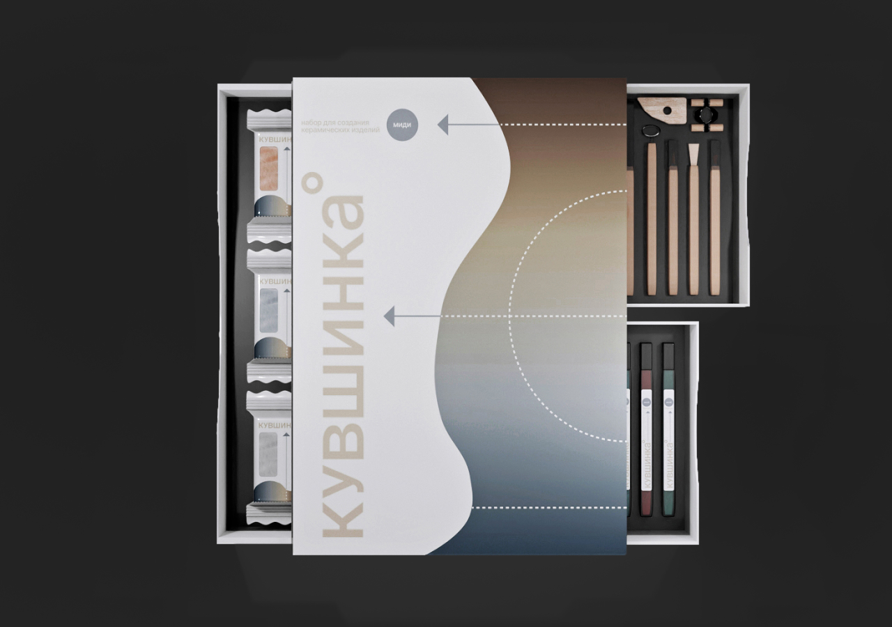
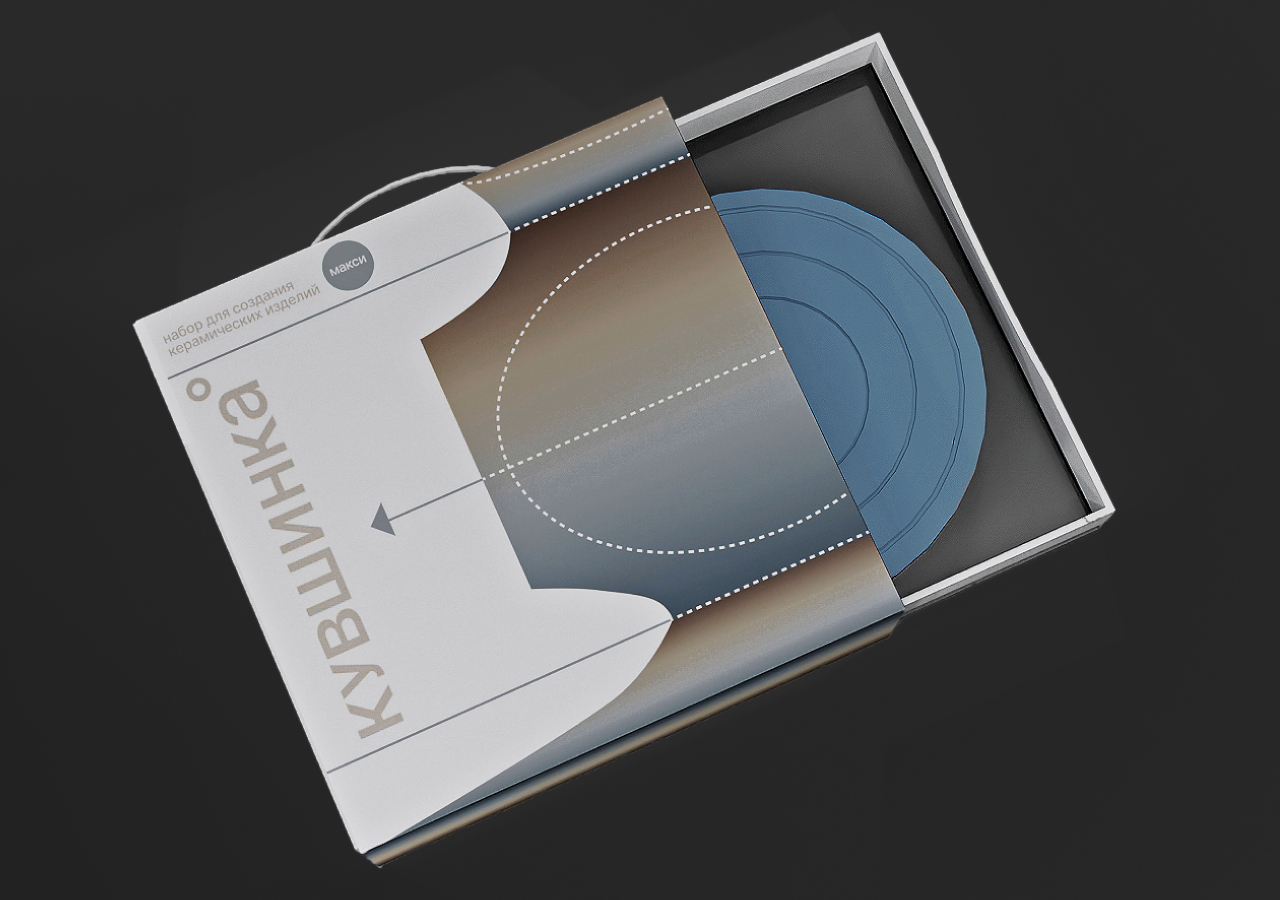
While continuing the visual identity, the packaging, first of all, pursues a goal, to be convenient and attractive to the user.



