* — Instagram и Facebook принадлежат компании Meta Platforms Inc., деятельность которой признана экстремистской и запрещена на территории Российской Федерации. Материалы используются исключительно в учебных и исследовательских целях.
Liquid Death is a beverage brand that transforms water from a neutral health product into a rebellious cultural symbol.
Brand Overview
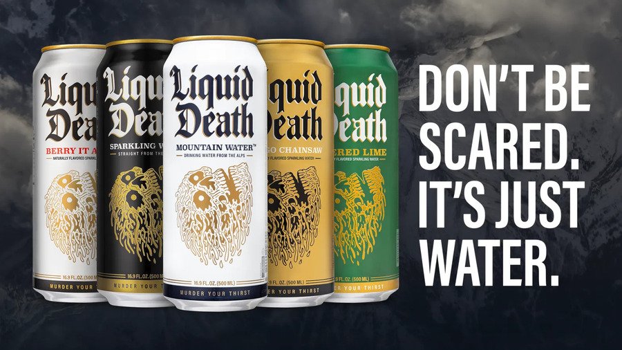
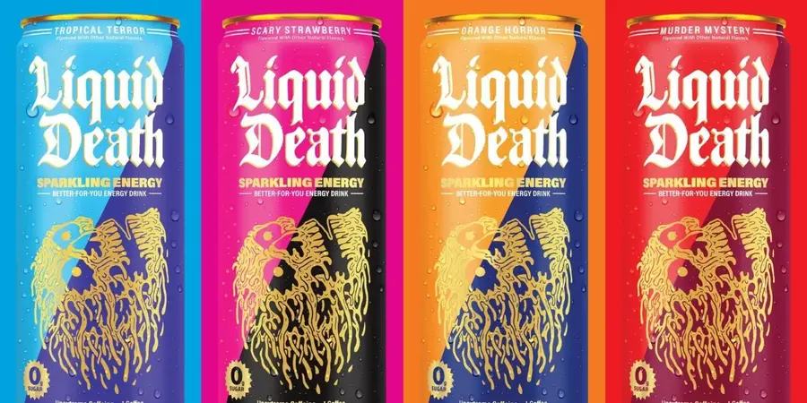
Liquid Death product line
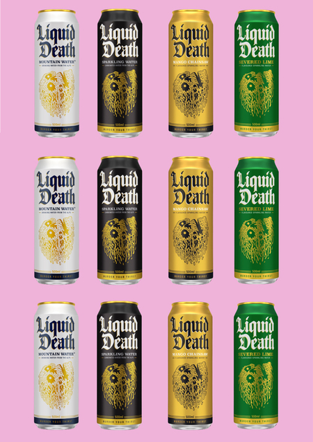
Liquid Death’s packaging is not just a container. It is the first communication channel of the brand. The tall aluminum can resembles beer or energy drinks more than bottled water, creating a visual surprise before the consumer even reads the label.
The name, gothic typography, skull-like logo, and dark palette make the product feel like a piece of pop culture rather than a basic drink.
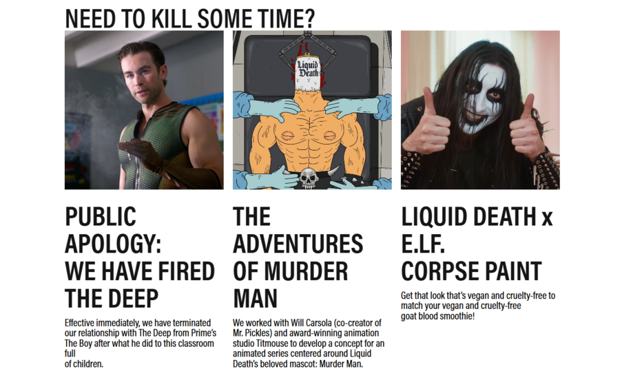
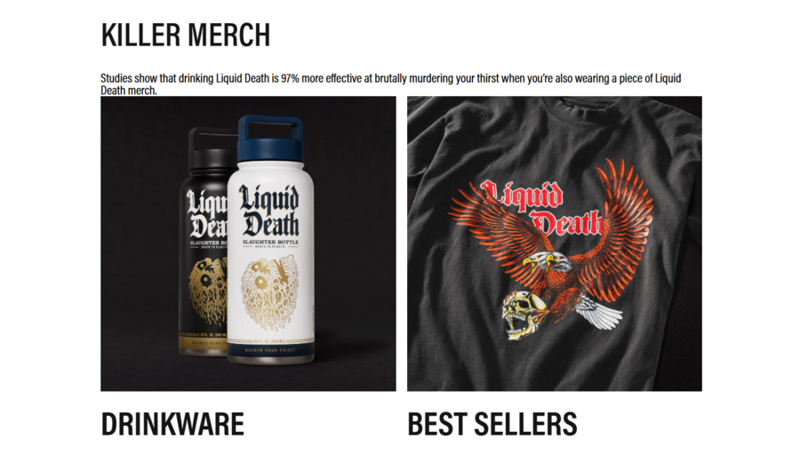
Liquid Death official manifesto
Liquid Death’s brand language is built around two repeated ideas: «murder your thirst» and «death to plastic.» The first phrase turns hydration into a humorous violent metaphor, while the second connects the brand to anti-plastic environmental messaging.
This allows the brand to occupy two spaces at the same time: entertainment and sustainability.
Brand Identity and Strategic Positioning
Most water brands communicate calmness, health, transparency, purity, and nature. Liquid Death does the opposite. It uses aggression, irony, darkness, and entertainment.
The brand does not try to look like «better water.» It tries to look like the least boring water in the world.
Liquid Death rejects the clean and calm visual codes of traditional water branding.
Liquid Death’s identity can be described through five recurring codes: black-and-white metal aesthetics, death and horror references, absurd humor, anti-plastic activism, and internet-native provocation.
Together, these codes make the brand feel less like a beverage company and more like an entertainment character.

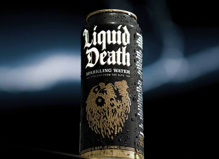
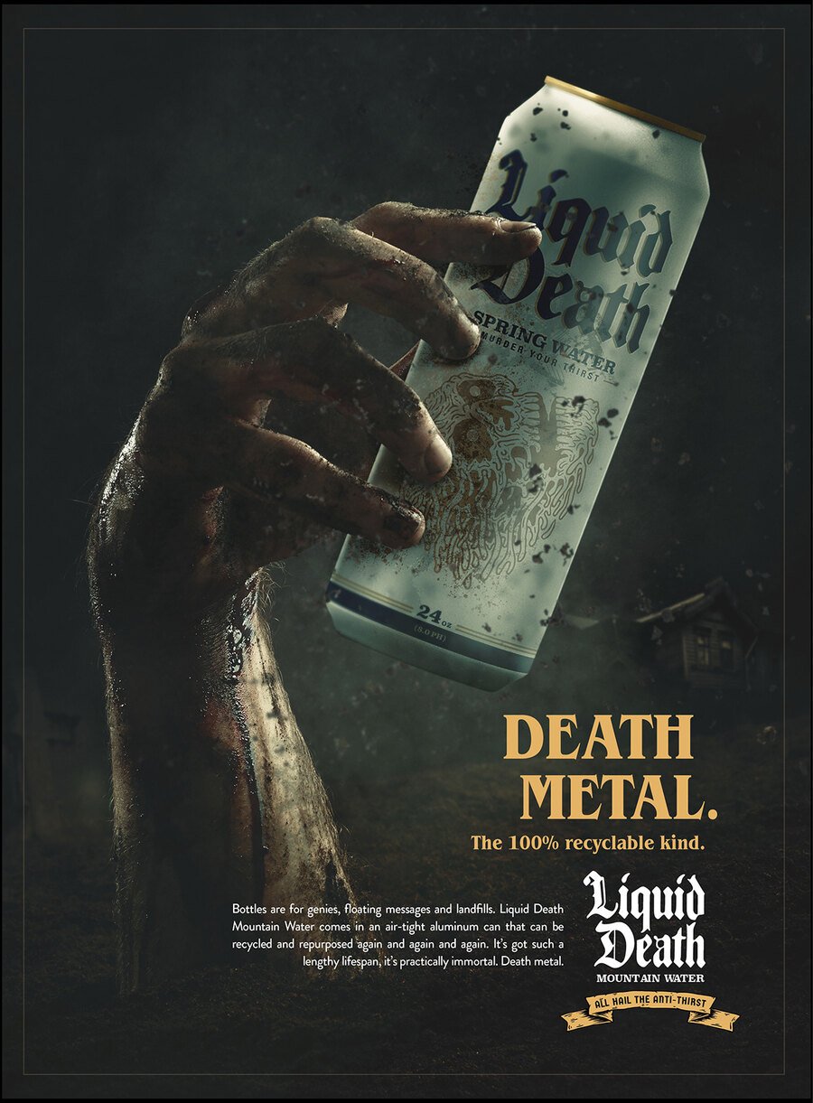
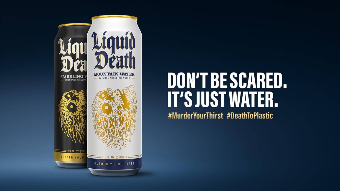
Liquid Death’s visual codes: metal aesthetics, horror, absurdity, and anti-plastic messaging.
Liquid Death primarily speaks to consumers who are tired of polished corporate wellness language. Its tone is especially effective for people who understand meme culture, dark humor, irony, music subcultures, and anti-mainstream branding.
The audience is not only buying water. It is buying a way to perform cultural taste.
Liquid Death functions as a social signal, not only as a drink.
Communication Channels
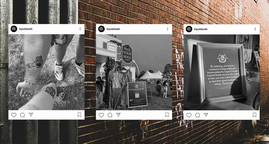
Liquid Death communicates through several connected channels: official website, online store, Instagram*, TikTok, YouTube, collaborations, PR stunts, retail packaging, and user-generated content.
Each channel extends the same dark-comedy universe. The brand does not simply advertise water; it builds a world around it.
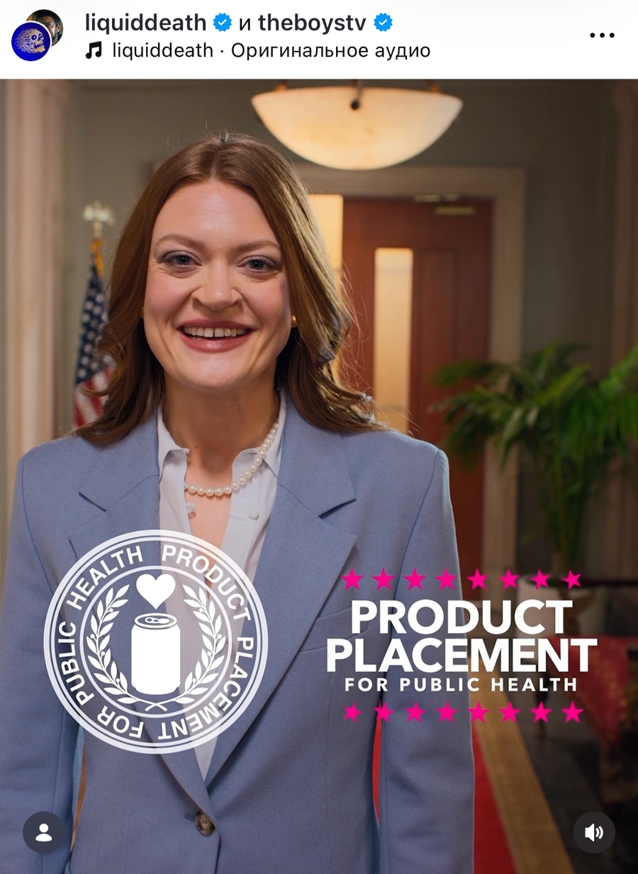
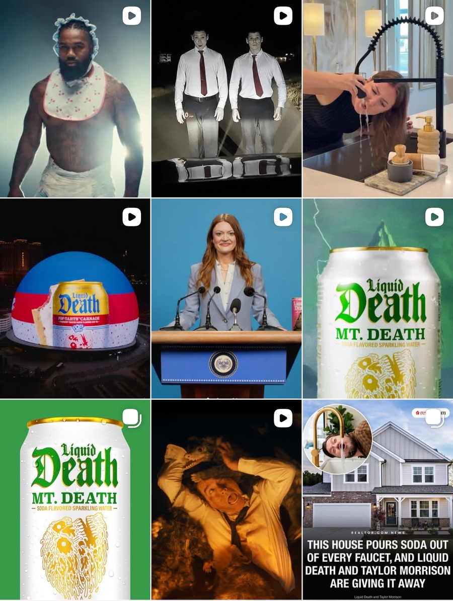
Liquid Death’s social media presence works like an entertainment platform.
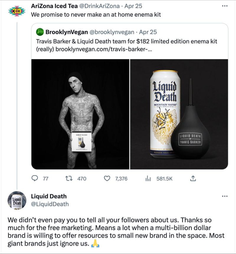
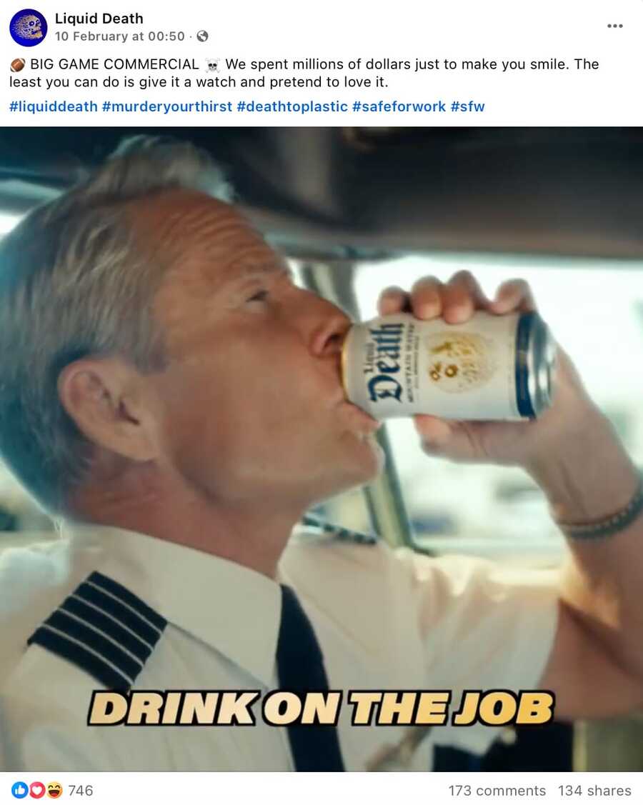
On Instagram* and TikTok, Liquid Death behaves less like a beverage brand and more like a meme account or entertainment studio. Its posts often use absurdity, dark humor, parody, and fast cultural references.
This helps the brand avoid boring product content. Instead of repeatedly saying «drink water, ” it creates situations where water becomes part of a joke.
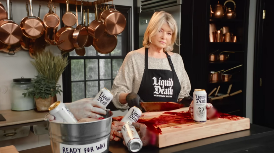
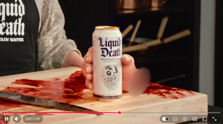
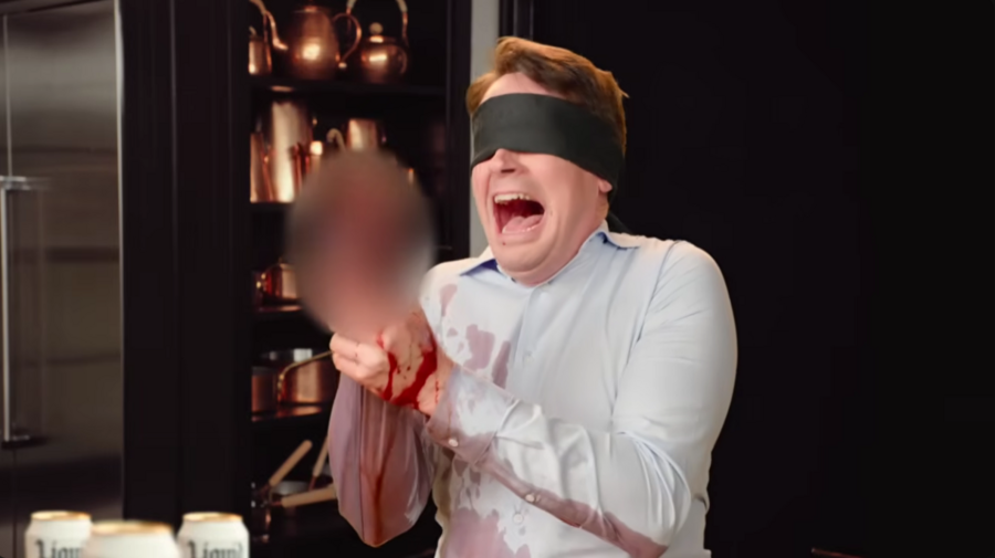
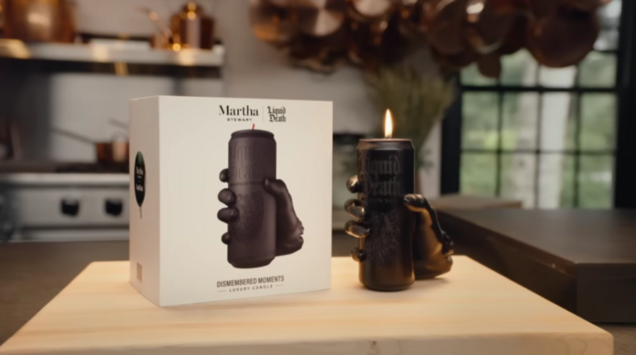
Liquid Death uses video as a format for absurd brand storytelling. «Liquid Death x Martha Stewart Candle Commercial»
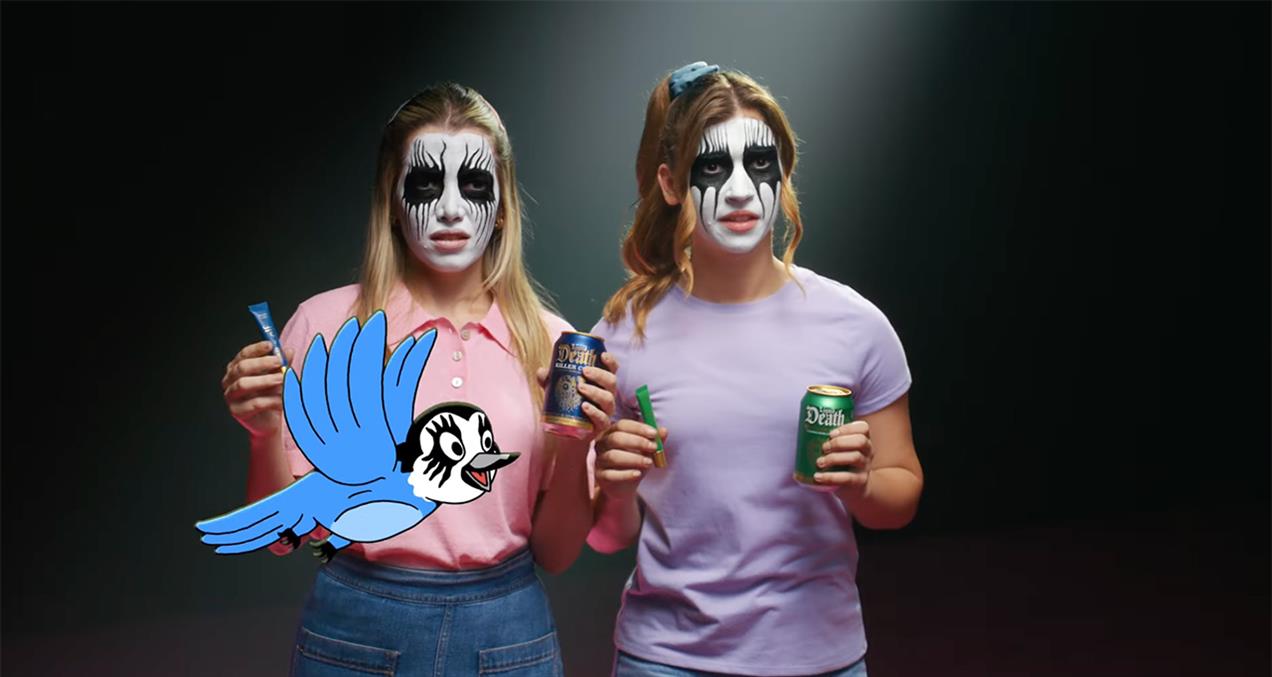
Liquid Death’s video communication often resembles fake public service announcements, horror trailers, music videos, or absurd commercials. This format lets the brand create longer narratives around a simple product.
The videos show that Liquid Death is not only a packaging design project. It is a content system.
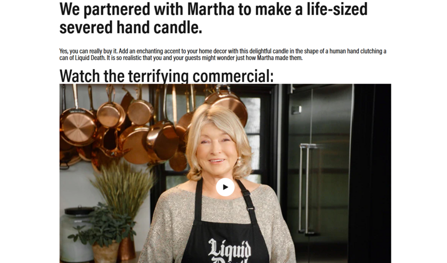
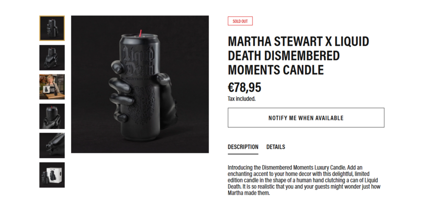
Martha Stewart x Liquid Death: Dismembered Moments candle
Liquid Death uses collaborations as cultural shortcuts. By working with unexpected public figures and formats, the brand turns product promotion into an event.
The Martha Stewart collaboration is especially effective because it combines incompatible codes: domestic elegance, horror humor, and canned water.
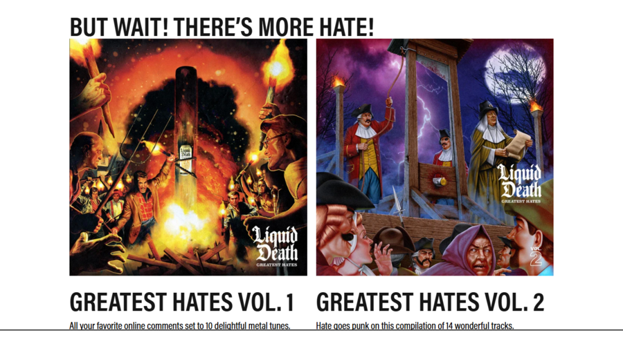
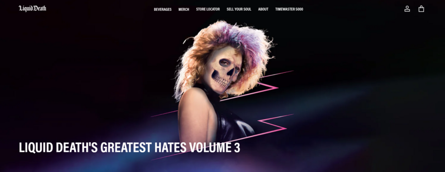
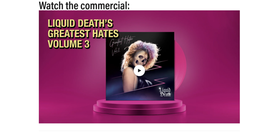
Liquid Death’s Greatest Hates campaign turns criticism into entertainment.
Liquid Death turns criticism into communication material. In the «Greatest Hates» project, negative comments become entertainment content.
This is a key communication move: criticism is not hidden. It is transformed into proof that the brand is visible, provocative, and culturally active.
Theoretical Framework
The first theory used in this research is the Elaboration Likelihood Model by Richard Petty and John Cacioppo. The model explains persuasion through two routes: the central route and the peripheral route.
The central route involves careful processing of arguments. The peripheral route relies on cues such as style, emotion, humor, attractiveness, or familiarity.
Elaboration Likelihood Model: central and peripheral routes of persuasion
Liquid Death is a strong case for ELM because its communication combines both routes. The central route appears in its sustainability message: anti-plastic rhetoric, aluminum packaging, and references to reducing plastic pollution.
The peripheral route appears in the skull logo, dark humor, gothic typography, absurd videos, celebrity collaborations, and shocking campaign ideas.
The second theory is Social Identity Theory, associated with Henri Tajfel and John Turner. The theory explains how people define themselves through group membership and distinguish their in-groups from out-groups.
Liquid Death is relevant to this theory because consumers can use the brand to signal belonging to a specific cultural group: ironic, rebellious, environmentally aware, and anti-corporate.
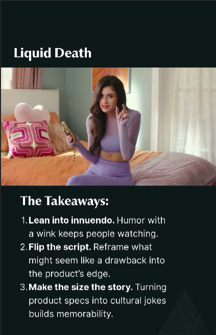
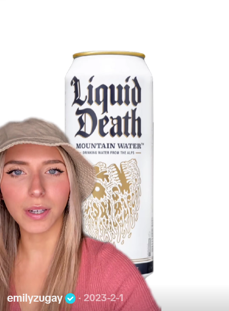
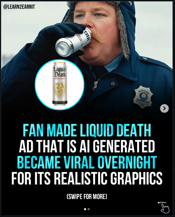
Liquid Death consumers use the brand to signal irony, taste, and belonging.



