Longread translated automatically
Original size 1140x1600

The packaging design concept is based on a metaphor comparing the similarity of long spaghetti and the shape of bicycle spokes. The concept emphasizes the belonging of black spaghetti to the healthy-food segment and healthy nutrition for sports. «Raggi delle route» — translated from Italian «Bicycle spokes». The sleek packaging in the shape of a cylinder made of matt black cardboard, with a special finish — gold stamping and UV varnishing, clearly indicates that the product belongs to the premium segment. The packaging design uses an animation of black stripes that works when the lids are turned — bicycles come to life and begin to ride. This is impressive and engages the customer in the communication with the product.

Loading...

Known for its black color from cuttlefish ink, the gastronomic dish could not be missing from the range of the world famous Italian pasta maker RANA. According to legend, the recipe for the production of black spaghetti was invented by the chef, who, due to his frugality, tried to add cuttlefish ink to give the original fishy taste. Today, despite its humble origins, these spaghetti are considered an exclusive delicacy for true gourmets. Spaghetti has an amazing taste and a full range of valuable macro- and microelements. Healthy carbohydrates provide strength and energy for sports and daily life. Spaghetti with cuttlefish ink is produced without preservatives and dyes, only from the highest quality raw materials and offered in a beautiful and elegant black packaging

Original size 1920x1200
Original size 1680x1050
RANA. Spaghetti al nero
Григорий Хромов создал упаковку для черных спагетти RANA, вдохновленную формой велосипедных спиц и премиальным дизайном. Упаковка включает анимацию, которая оживляет изображение велосипедов при открывании крышки, подчеркивая уникальность продукта.
Project description created with AI
Project created at 18.05.2023
More projects in packaging design
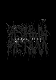
Анна Докалина разработала упаковку для продукции Каслинского завода архитектурно-художественного литья и рекламной компании бренда. Упаковка защищает литьё от повреждений и сохраняет его декоративность с лаконичным дизайном.
Layer
Layer
107
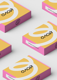
Авторы Елена Пантюхина и Алексей Пушков создали фирменный стиль для бренда «Слой», который объединяет пекарни и новую школу выпечки. Проект включает логотип с наклоном, метафорический завиток и цветовую палитру, вдохновлённую начинкой выпечки.
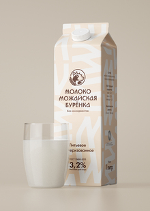
Александр Петухов создал визуальный бренд для молочных продуктов «Mozhayskaya Burenka» с учётом исторического наследия завода и традиционных рецептов. Проект включает уникальный шрифт и палитру цветов, отражающих местные особенности и связь с историческим дизайном упаковки.
Фёдор Щепин создал проект о семейной ферме «Круча» в Калужской области, которая производит натуральные продукты. Проект включает описание фруктовых, ягодных и овощных культур, пасеки и лавандового поля на небольшом холме.
We use cookies to improve the operation of the HSE website and to enhance its usability. More detailed information on the use of cookies can be fou...
Show more