Визуальное исследование рассматривает тенденции конструирования различных по форме модулей для создания модульных шрифтов в 21 веке. В качестве основных критериев для отбора модульных шрифтов, были выраны: яркость, разнообразие, выразительность, нестандартность конструирования, необычная форма модулей. Всего было отобрано и исследовано 30 шрифтов, подходящих под критерии, от самых разных студий и авторов.
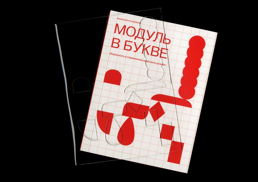
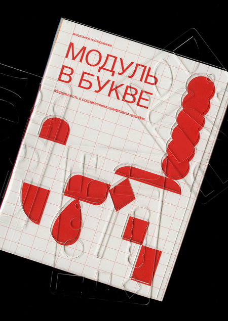
Специально для книги была создана супер обложка из пластика, в которой прорезаны совпадающие с обложкой модули.
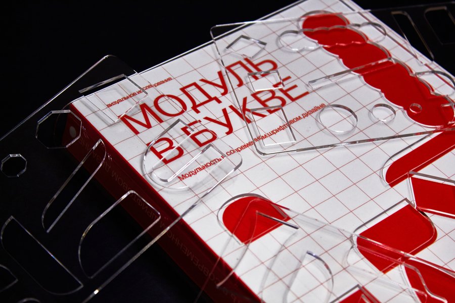
Обложка книги.
Принцип отбора материала основывается на 3х уровнях сложности модуля в шрифте: simple, medium, hard.
Дополнением к книге были сделаны линейки для каждой главы, каждая линейка состоит из модулей выбранных из шрифтов каждой главы. Линейки кладутся в каждый шмуц титул книги.
Шмуцтитулы трех разделов книги: «Simple», «Medium» и «Hard».
Устройство типовых разворотов книги.
Устройство типовых разворотов книги.
Устройство типовых разворотов книги.
Для полного просмотра шрифта для книги были сделаны специальные клапаны, на которых можно увидеть шрифт в разном кегле, а также полный набор знаков. Клапаны предусмотрены только для шрифтов с шрифтовым файлом.
Ссылка на каламео: https://www.calameo.com/books/0061995261dab298b87f4
Постраничная раскладка макета.
Постраничная раскладка макета.
Постраничная раскладка макета.


